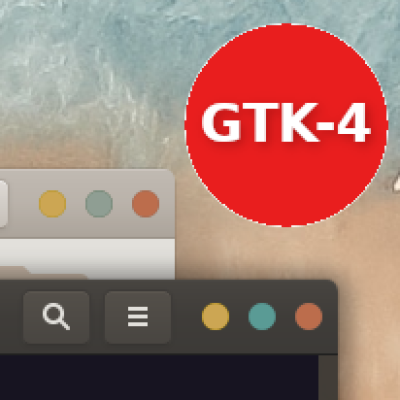
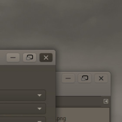
Ambiance-RW-blue See at second screenshot !
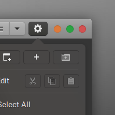
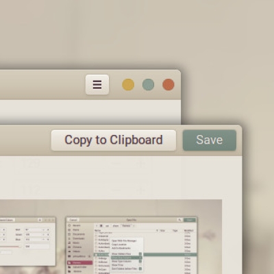
Ambiance-RW-DS See third screenshot !
Ambiance-RW-DS-blue
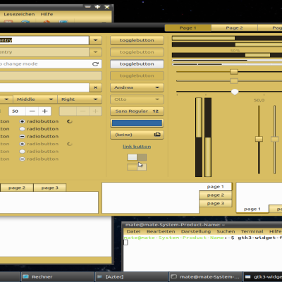
This is a re-interpretation of the Ambiance-theme, and theming is done for the gnome-desktop only. No support for other desktop's.
The original Ambiance theme is part of Canonical official themes (https://launchpad.net/ubuntu-themes) and has the license GNU GPL v3, Creative Commons - Attribution Share Alike
The themes presented here are in no way affiliated with the official Ambiance theme.
The changes are made with respect for the way it was written: this means changing colors in 'main.gtk.CSS' will have no advers effect on the changes I've made.
I've only redone the GTK 3.20 file, so the changes are only visible in a gnome 3.20+ (yes, also 3.2
So what is changed?
Version 1.0
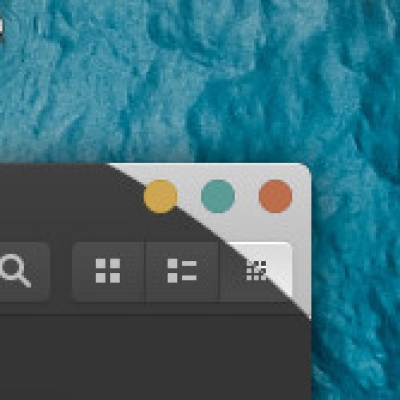
Titlebuttons are now a little further away from eachother.
The headerbarbuttons are reduced to be less clunky.
Reduced the size of the switch button in the headerbar-button.
Nautilus sidebar is recreated to experience hover-effects and new button-style.The background is a color-gradient and the (ugly) separators are refined. The right-side of nautilus is now consistently white.
Remade the left-pane of Tweak-tool to create hover-effect and same styling as the nautilus side-bar.
Revamped the left-pane of the new Settings-app to act the same as the left-pane of the Tweaks-app.(removed zebra-stripping)
Removed the white border around the tooltip.
popover-menu's are 'modernised' with gradient-colored backgrounds, fuller buttons, and shadow-effects.
App's with a menubar have an consistent gradient-color to match the titlebar, so they look as one complete background.
Removed the gnome-terminal-code, because you can choose your own background via profiles.
Window-shadows are bigger overall.
There is still much room for improvement in the Ambiance theme.(f.e. the buttons are still images, when GTK 3.20+ makes it possible to recreate buttons using CSS only.)
Please try before commenting or rating
Version 2.0
I've redone the headerbar bulkier and readjusted the height and size of the headerbar buttons. Next I've done away with the backdrop-state of windows, so focused or not the heading looks the same, this was done to simplify GTK2-theming.
The blue version is an idea of 'phayz' who had trouble changing the theme, so I've done everything for him (which, btw Phayz, was a hell of a job. That orange come popping up everywhere...) I hope You like it.
Version 3.0
I have fixed the font-choice of context-menu's (holding initial font).
The nautilus-sidebar-gradient is lighter and softer in the standard version.
The titlebuttons: I reduced the white shadow so the buttons look less heavy. Also - because of the darker headerbar - recolored the standard-close-button to a darker-orange.
Added a transition time delay, so buttons react smootlessly into another state.
Redesigned the hamburger-menu-items in hover-state, and hover-state-backdrop with shadowed text.
drop-down menu-item in comboboxes are remade with gradient-background and shaded buttons in white.
Biggest change is the addition of two new companions: Ambiance-RW-DS (Dark sidebar) and Ambiance-RW-DS-BLUE. I have redesigned the nautilus-sidebar (and filechooser-sidebar) so that the icons-background looks seperate from the background of the places-list.
There is still much room for improvement in the Ambiance theme.(f.e. the buttons are still images, when GTK 3.20+ makes it possible to recreate buttons using CSS only.)
Please try before commenting or rating






Ratings & Comments
31 Comments
The only downside to this theme is that it is very hard to distinguish between the active and inactive tabs (eg, in terminal or gedit). It would be a great usability improvement if either the contrast between active/inactive tabs could perhaps be increased, or if the active tab could have a coloured underline or similar to make it stand out better.
8 Attractive and functional theme, much better (and with better contrast/visual accessibility) than the default Adwaita
10 Ambiance-RW-DS just like I was used to when Canonical still shipped Unity. Very well done. Thanks.
10 10 the best
Works perfectly fine on Debian 9 Gnome 3.22. Thank a lot for your great job!
9 +9
shame there isn't an Xfce version
Hi, nice work! But how can I get those folders in blue? Also... the close button can be turned into blue? The alert messages confirmation button are still orange. Can those be turned into blue too?
9 Very nice theme! Congrats!
Hey! Fix it please! I love this theme on xubuntu! Please fix it! Thanks
Sorry, theme changes are made for the gnome-desktop only. Use the official Ambiance theme instead.
Awesome, where did you got the ambiance blue icons?
9 Super, blue theme is just what I needed.
There seems to be something missing for menus. In many applications (e.g. geany) the context menus are displayed with light text on light background instead of dark background. So only deactivated menu items are visible whereas activated entries are nearly invisible
For some reason the problem has gone now. Works now perfectly
"The blue version is an idea of 'phayz' who had trouble changing the theme, so I've done everything for him (which, btw Phayz, was a hell of a job. That orange come popping up everywhere...) I hope You like it." Sorry for replying so late but I *love* the blue variation. I can only imagine how much time, testing, and tweaking it took to get it looking so good. Thank you!!!
Hey, I was wondering if Xfwm support was planned, as the original Ambiance is broken on xfce.
why on my Ubuntu 17.10 any 3d party theme y install I have Terminal ugly and for example Gimp in a ugly old gtk2 look? But default themes from Ubuntu all is well? Pixpuf and murrine are installed correctly....
terminal command: sudo apt-get install gtk2-engines-pixbuf Or reinstall Ubuntu. There is something missing
I edited `gtk-main.css`, changing "@define-color selected_bg_color #318dc6;". That has worked for most of the GTK UI, but I am still seeing the dark orange in buttons etc. How do I change the colouring of drop-down lists? At the moment the highlighted element of a drop-down list is dark grey on a blue background. If I change `selected_bg_color` back to its original colour, I see dark grey on a dark orange background.
I've uploaded a special version for you, hope you like it
I have just tried it, and it looks good! The only problem I've seen so far is that in Nautilus, files' names are invisible.
please post a screenshot, and what is your set-up
Wow... thank you!
This theme is 'old-school', in that it contains allot of images to create the buttons. (Which btw is no longer necessary in modern GTK3). Unfortunately the buttons(in focused and active state) have orange edges. So there is nothing you can do there. Or you can use Gimp to change the colors of these buttons (in the file 'assets'). About changing the selected_bg_color: well I did the same to test it. And I do not experience any dark grey in any drop down menu's of GTK3-apps. Make sure you change the GTK-3.20 file and not the GTK-3.0.